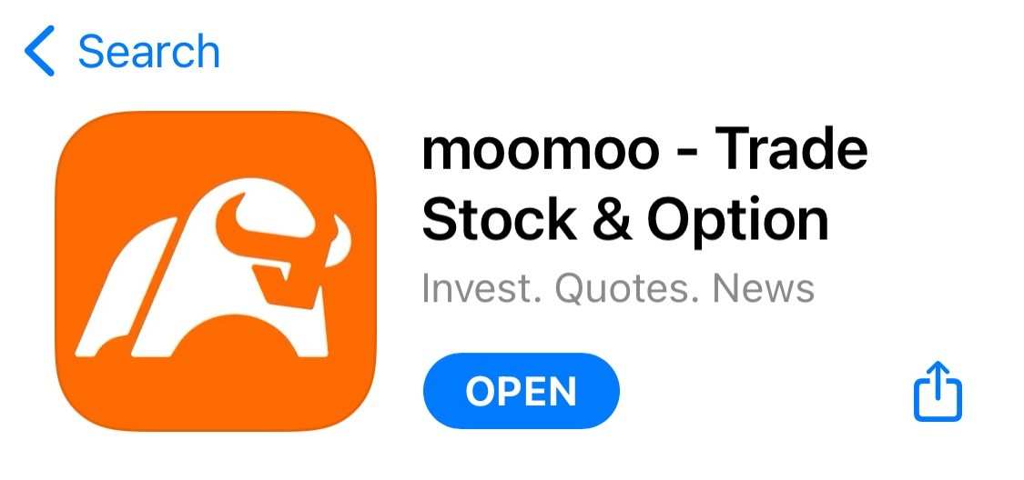
The origin of moomoo "new" logo
$Futu Holdings Ltd (FUTU.US)$
Many of you know that moomoo recently changed its logo – from the logo that moomoo long shared with Futubull to an exclusive just-for-moomoo logo. (If you haven’t seen it, just update the app on app store or google play.)
Many of you know that moomoo recently changed its logo – from the logo that moomoo long shared with Futubull to an exclusive just-for-moomoo logo. (If you haven’t seen it, just update the app on app store or google play.)
There’s a story behind this change, and I’d like to share it.

Early on, we made a unique logo for moomoo, but decided to keep it under wraps and instead use Futubull's logo for moomoo. The reason was simple: To let everyone know that upstart moomoo was developed by Futu Holdings – a bigger, more established brand.
We’re happy that that’s not necessary now. Thanks to a great team, great products, and great customers like you, moomoo has become a familiar name in the markets it serves. It’s growing quickly as a business, and has built a bulletproof reputation among its customers. So we reached a consensus that the time was right to bring back moomoo's exclusive logo.


Three years ago, we named the international version of Futubull "moomoo.” After that, I asked our designers to design an independent logo for moomoo to better represent the international essence of moomoo.
Our conscientious designers came up with several proposals (below is one example), including an integration of the letter "M" and a bull's silhouette, an abstraction of a bull's face overlayed onto the letter "M,” a depiction of a bull's head, etc. Although great from an aesthetic standpoint, they lacked the essence and familiar evocativeness we were trying to capture.


I said to our team, "We could select a logo from these proposals, but none of them is exactly what we want. How about redesigning one? In fact, let me show you a picture."
I sent the below picture of the Charging Bull in front of the New York Stock Exchange to our designers. "Look at the picture from this angle. Let's make a logo with a flat silhouette."
"We’ve got you!" they replied.

The first draft was upright and sedate. The second one conveyed strength and action, with the bull appearing ready to charge forward. Using the Golden Ratio, the designers further refined this into a third version. Moomoo's original logo was born, merging the outline of the letter "M" with the power and familiarity of the Charging Bull.
And now, we’re proud to publicly debut moomoo’s “new” logo – which, as you now know, is the logo we originally intended for it.


We see this effort as more than just work. We see it as more than design, too. To us, it’s refinement. It’s reinvention. And it’s how we run our company.
---- Leaf, Futu CEO
Any thoughts on moomoo’s “new” logo? Feel free to leave your comment below.
Disclaimer: Moomoo Technologies Inc. is providing this content for information and educational use only.
Read more
Comment
Sign in to post a comment
phtan68 : Give me the golf ball
Ggggggggggggggg : I like the design. Any free gift that with that logo? Wonder so many gift for HK user
 ! From: Singapore Users
Please giveaway more free gift for Singapore
Moonew : love the new logo. same comment, any gift for Singapore user? HK friends just like to show off their futu gifts.
71274309 : Nice!
Avea Low1115 : Hi
ifgogo ifgogo : awesome look
MR CLARK KENT : Like
Ten Step : The change in angle on the final draft was just the right tough
Mars Mooo Ggggggggggggggg : Supported more rewards and free gift. Thanks.
Ggggggggggggggg Ggggggggggggggg : @Team moomooplease


View more comments...