Everything About Stock Heatmaps That Investors Should Know
What Is a Heat Map?
A heat map is a 2-dimensional visual representation of data, displayed as a map or diagram with data values represented as colors. It is said to have been used since the 19th century, primarily to display population density. Nowadays, heat maps are widely used by businesses to analyze website usage patterns, and they have also been extended to trading and investing.
A stock heat map shows investors where liquidity is in a market and how liquidity providers behave on a given day, based on three parameters: color, brightness, and area. Thus, it is important for investors to understand how to read heat maps and filter variables for a detailed market analysis.
What Are the Features of a Heat Map?
Keying in "heat map" in any search engine will yield a graph with ever-blinking red and green boxes of different sizes indicating the codes of different stocks. Before learning how to read a heat map, an investor should be familiar with its different features. As mentioned earlier, heat maps are typically drawn using three different parameters: color, brightness, and area.
1. Sector Area
Take a stock heat map drawn by Market Capitalization (Current Share Price * Total Number of Shares Outstanding) for example, the larger the total market value of the particular stock, the larger the area it takes on a heat map. Apple Inc., having the largest market capitalization of $2.268 trillion in the Electronic Technology sector, would take up the biggest sector area.
Taking the stock market capitalization as a fraction of the total market capitalization, multiplied by the total area, will then give us the sector area that this stock takes on the heat map.
2. Color
Depending on the filters such as market capitalization or trading volume, red and green are two common colors observed in a heat map.
For instance, when we filtered trading volume, the green color represents an upwards movement in the stock's trading volume while the red color means a downward movement in the trading volume.
3. Brightness
Stock prices fluctuate daily, and a heat map provides an investor with a visual representation of these fluctuations at a glance through different shades of colors. The deeper the shade of these colors, the greater the fluctuations.
Reading a Heat Map
Based on the different filters, a typical heat map can illustrate to the investors how the market is moving in real-time, whether the trading volume has been going up or down in the specified time frame, say 1 hour. Coupling this information with analysis and market news, an investor can make a more informed decision when it comes to investing in a certain stock.
While the aforementioned provides an investor with a brief overview of the market movement, an investor can learn more about the macroeconomic factors behind general market trends which can help him or her to potentially capitalize on these swings.
How Can Heat Map Features Potentially Benefit an Investor?
It has been a popular tool for traders who wish to visualize a huge set of data in real-time. Compared to traditional charts and tables, the heat map format for some can be more understandable and visually accessible. This can help an investor make not just an informed decision, but a faster one as well.
Some heat maps have the ability to toggle between the different parameters such as markets, industries, trading volume, PE ratio, etc., which can help an investor quickly compare the different stocks.
However, as convenient as a heat map can be, it can sometimes mislead investors as it only provides a certain aspect of the trading information, and this can lead to a wrong trade decision.
A heat map does not provide all the necessary information required to make an informed assumption about a trade. For instance, when a heat map shows a downward trading volume of a certain stock, it does not provide any information as to why this happened, and what factors involved led to this movement.
Using Heat Map Features via moomoo
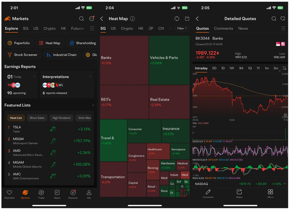
You can access the heat map features through the moomoo app. To begin, click on the 'Markets' tab at the bottom of the screen. After which, you will be able to select from a few options at the top, such as 'Industrial Chain', 'Stock Screener', etc. After selecting 'Heat Map', you will be shown a list of countries. You may toggle between these countries based on your investment preference. After clicking into a certain industry, you will then be able to learn more about the performance of the industry of the specific country.

Images provided are not current and any securities are shown for illustrative purposes only.
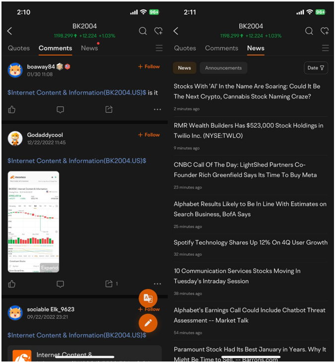
After clicking into the industry, you may click on 'Comments' at the top to learn more about what other investors have to say about this industry. Also, you may click on 'News' to study the related news within this industry. This ensures that an investor is kept updated on the news happening within the industry, hence being able to make a more informed investment decision. Sign up and download the moomoo app today to access the free stock heat map!

Images provided are not current and any securities are shown for illustrative purposes only.